Bootlog

Icon

Another ignorant blog about user experience in real life and digital adland

Jingle Balls

It’s time to start all sort of Christmas campaigns. They’re mandatory, whatever the cost. And I do not mean the financial side of it, quite often it can be simply brand destroyer or rarely booster. Remember the Coca-Cola convoy? Poland is still haunted by it every year.
It is the tradition that takes priority, be it brand tradition or if there’s no sufficient sober brain cells in agency it must be traditional Christmas crap. Not that the tradition or Christmas are crap. It is the application and combination of brand themed elements, festive season and perhaps too much booze, that make it really tacky. Recently Grolsch
embarrassed themselves with this xmas wank:

Grolsch & the Swingtop Philharmonic Orchestra presents a ‘video Christmas card’ featuring a magical rendition of the classic carol ‘Oh, Christmas Tree’ played exclusively on instruments crafted from Grolsch Swingtop bottles.

On the other hand similar idea: acclaimed musician, famous tune and beer can take a really positive turn. Guinness put the brand in context of actual celebration and pure fun. They way Christmas should be.

P.S.
Grolsch had potential but they seem to have missed the contemporary classical approach to music a la Schoenberg, next time more research would be recommended.

Fresh air

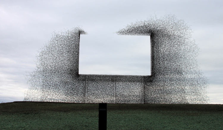
Lead Pencil Studio bilboard
Made by leadpencilstudio

Commodity and monetization. Bollocks and bullshit. God and bad. Big space in between. This piece is amazing and pointless at the same time, one may say. I think it is very interesting, unless you read what one of the author has(actually not) to say

Borrowing the effectiveness of billboards to redirect attention away from the landscape… this permanently open aperture between nations works to frame nothing more than a clear view of the changing atmospheric conditions beyond.

I like the ‘interpretation’ from fascodesign(directly under the above quote):

Which sounds nice and poetic and non-threatening, but clearly, this thing is a monument to everything America’s not.

I think that now everyone can say whatever fits their agenda. But still this is the thin border between not only art and architecture, because there’s third party involved which is advertisement. All of them are shouting from that piece, I am not sure if it is about consumers, McShit or other capitalistic conveniences tho. This wouldn’t even be sarcastic whispering. One cannot cut own feeding hand. The last one in this case, the second one is either wanking or on the phone. We all know what I think, if not here’s the tip: this shouts about anything you put into, that’s the beauty of it, like blank canvas, you can paint anything on it. Although my first impression was that this is a typographic experiment gone really bad and all the copy exploded. I was sure this is an ad of some sort. Since it’s not an ad, then what the hell is it? An art? Does it have the famous title Untitled? No, it is even better Non-Sign II. An abstract interpretation of a sign. Anyway, the scarcity and the opulence are quite well balanced and I think that’s it. An abstract that needs no additional abstraction. Well done.

All You Need Is i

Is there such a thing as UX of a newspaper? There wasn’t as such till now.

Few days ago a new newspaper has been launched. It is called ‘i’. Quite uncreative, I know. But it has the big idea behind it and apparently an amazing strategy, we’ll see its that better soon. At the moment all those trimmings and perhaps even a cherry on top of it makes it surprisingly exciting, see for yourself:

i is specifically targeted at readers and lapsed readers of quality newspapers, and those of all ages who want a comprehensive digest of the news. i will combine intelligence with brevity, and depth with speed of reading, providing an essential daily briefing.

Being a target audience for this new ‘invention’ I went to buy it and see if it actually does what it claims to. I hardy buy newspapers these days although I do read loads. Anyway. It stroke me while I was reading it that they want to attract people that are dealing with interactive interfaces on daily basis. Then the modern paper should combine not only witty writing but also some of the UX best practices. I do not mean clicking on things etc. because this is not the case. I mean flow and functional quality of information, page designs(iconography, visual language etc.). Web is already full of inspiration and I hoped creators have done their homework.
I was wrong. Very wrong. My excitement wilted with page 2 when two things happened. First was discovering that my fingers are black. I was naïve to think that nobody does it any more. It is XXI century for God’s sake. Even the free pulp invested some money in proper technology. Second was a bit more complex because full page of very short stories made me feel like I want to click and read more… Yes, click on a printed text. Why? Because those snippets were badly written for the purpose. On the web, it is mandatory to make one to click on a headline. In a newspaper that claims to be a serious player this writing was way too good because there was no ‘read more’ option. This was the end of good stuff, the rest was a sad disaster. Days old news, scratching the surface, cheap jokes and it all looks simply like just another newspaper. Actually like the LondonPaper judging by the font. I even had this thought that some old pricks that still have no idea what’s the difference between blog and email is, have decided to create a new product based on their old false and arrogant strategy. They’ve hired their mates, spent all the Russian cash they had  and now they’re thinking where to run to. I couldn’t find any info on the editors, only that it is the Independent that is shitting on their own brand with this piece of mediocre writing.

We are creating a newspaper for the 21st century, designed for people with a thirst for information and entertainment in the limited time that they have available’
ANDREW MULLINS,
MANAGING DIRECTOR,,
INDEPENDENT PRINT
LTD (PUBLISHERS OF i)

First prize for the best waste of space goes to the weather column which does not have any information apart from an image and number of a page where you may find this information! Bit like good old web: “to contact us please scroll down and click on this rotating 3D crap in a bottom of our page”. That’s not all! Once you get there, to page 40 you’ll see the most amazing piece of design ever. Full  page weather forecast. Yes. Full page. Huge map and plenty of large numbers around the map, not on it. That’s the first impression. My first thought was – this is a forecast for the whole week, quite large numbers indicate importance of this piece of information. Actually someone fucked up hierarchy of information and after a long while I have realized that it is not what I think it is simply because 13 does not follow 15. It turned up to be… temperature in cities that were mentioned in such a small type that I found it hard to believe someone actually approved this page. It was pretty hard to figure out London’s forecast. Access to information reminded me of those elevators for wheelchairs that are too narrow to fit a wheelchair into it. One more thing confirmed myself in the belief that some old blind idiots were behind this dirty prank. It was a weather forecast for… the day before. I am not making it up. In a bottom of page 40 there’s an information telling us what was the weather like day before! WTF!
The rest of the paper wasn’t that funny, just traditional newspaper elements: crossword, comic strip etc. Where was the newspaper UX design? Only in my mind. Growing pretty fast. Idea of utilizing web interface for print was in my head for very long time but this paper was a perfect opportunity to establish a new standard for contemporary news writing and reading. Because the old model is based purely on writing and it does care about the reader in third or fourth place when it comes to kerning, pagination etc. By reading I mean taking in consideration not only the ‘user’ but also user’s behavior and requirements. That old school design needs to grow up and expand. There are many new kids on the block.

Widgets – where is their place in the newspaper? I am sure there is place for them. They just need to be translated into a format that would make sense.

Colour-coding? It does exist on a level that is more than disappointing, some colours on top of every page but not on page umbers or corners. Quick access is what the i is claiming too. If I am interested only in world news I want to be able to jump quickly there without going through the whole paper. On the web I click, how do I do it in print? I skip pages because design allows me to. What about safe tearing off content I won’t read at all but someone else would be interested in it?

Clear call to action? Actually CTAs in general do not exist in paper world as functional elements that relate to navigation through the newspaper. All right, ‘read more’ and ‘go to the page…’ have always been there, but when we’re talking about short pieces of info those ones are irrelevant. And telling people to visit the website for ‘more’ is like telling someone to go fuck himself.

On the other hand: how to write a headline that the reader wouldn’t want to click on to read more and  will be full looking forward to eat another snippet? How to use margins in informative way not only to ease the ‘navigation’ but also to deliver content(vide weather joke described above). Actually how to make a newspaper functional again? How to make useful ‘text scanning’? This is actually a bit too much for the writers today but there’s certainly a light at the end of tunnel.

Many of those questions can be answered after a quick consultation with UX designer that does have enough experience in digital as well as some print background.  Yes, like myself. But that’s hardly the point. The real point is that it took me less than 40 mins to review this paper while on the train. It would took another hour to scribble and communicate all basic changes that could be beneficial and perhaps to save the paper because it is going nowhere. Unless they want to steal some of the The Sun readers who have recently learned new words such as blog, twitter and email. But that’s hardly worth 20p for them. And the lack of famous page 3 does make it even less attractive. I do not mind paying someone to do the job for me, job of filtering, condensing and serving in functional way all the content I can find on the web for free. But now I’d rather read the Standard which unfortunately has recently lowered the bar and left my league. It is not the content that is important at the moment and I cannot judge the quality of it in the i, but I have all the  rights to raze it to the ground if it is claiming to actually work on my territory. Especially if it is not working and the i was born with horrible defects that now will hurt until it dies or someone heals it.
Tabula Rasa

White is a game. White is an art. White is an art of killing in any sense. Brainless and beautiful at the same time. You do not need any skills, you do not need to force yourself to think. This sounds like an ordinary shoot-to-kill game, doesn’t it? Not really the case this time, I am afraid.

Created, apparently, by first-year students at ENJIM, the Graduate School of Games and Interactive Medias in Angoulême, France is as innovative as Little Big Planet. Brings, actually fake, element of creativity. This is what the authors say:

WHITE is the first FPS based on both the player’s violence and creativity. The score only depends on one thing: your talent!

Talent! What talent? One, old prick perhaps, would ask. There’s not talent involved. Since a while there’s completely new category of creativity and we cannot deny it. Having spent almost many eyears working hard to get two MA degrees in arts, (actually creativity) I have been told that there’s such a thing as talent and this is the only way of achieving success in art world. I wasn’t that sure about the fact that one has to born with it. Then I saw Joshua Davies and he really pissed me off. I was educated with quite old school tools and terminology. I was very impressed with Jackson Pollock tho, so Davies’ random shit shouldn’t be a problem. Or I should rather say this new aesthetic category of random digital creation didn’t fit any of my boxes .I was also into actionscript and under huge influence of net.art which was a bit of anarchistic punk culture that grew pretty well on moist and well nutritioned soil of the web. The popularity of random art was a bit too much, or was it the ‘pop’ factor? It seems so now. Net.art is long gone, Joshua Davies drives free BMW and Marian Bantjes took their place. Every whore gets old and useless at some point, I know that from experience and I hope those kids can re-invent ‘action-painting’ on digital canvas. Simply because this fits contemporary need for creative expression. Not impressionistic crap or post-modernistic bullshit. Completely new(or new again) form of self expression that does not require talent, skills, brains, education etc. Sorry but we all deserve it. If any of those ‘-ism’ wankers think otherwise they shouldn’t have raped people’s brains for so long, taking away the right to artistic expression from people. Not that I am suggesting pop-culture winning over high-culture but I think that postmodernism has eaten its own tail already and if there’s no other option we can expect next gen of Salon des Refusés or maybe something that Napolen III has initiated: public judgement. God save us all!

PLAYBUTTON

Is there still time for this? Is there still space for it? Do we need to remember how it was when things were fixed? What about those who will never remember, for them this would be fun, or curiosity? In what context?
So many questions from just one button. I personally love the idea of Playbutton something that is between those two historical functionalities. One is the iPod’s hidden complexity behind one simple button and the second is this old school singularity of objects. Who would want to carry a box of tapes and change them to listen to just a single track and then change back to listen to another one? Well yeah, some dickheads would to show off, but being honest I cannot imagine making life again complex like it was back in the days. I cannot refuse myself being able to be free, or a bit more free to be precise, in making choices. On the other hand there’s this temptation of having physical exemplification of those choices. Having them touchable, sortable, putable and losable. How does one lose an mp3 song? Doesn’t. One cannot lose mp3, one can delete it or forget where it is among millions of other mp3s and one can easily get a new copy at any time. It is then impossible to lose a piece of music in a way that somebody else would find it between the seat and side of the bus and then play it in their mp3 player. Tangibility of music remains only in buttons we press to play it. And, as cliché as it sounds, music has lost its physical appearance. CD or a tape were the music, they were not just the objects. We haven’t lost it. We just made our life easier by getting rid of the middle-man, yet still we long for yesterday. And it is not because of the objects(well, in consume driven world we are dickheads and we do think so), it is because we had a medium that helped us to appreciate, now when it’s gone we do not feel like we posses it. To remind ourselves, Walter Benjamin wrote that the aura is gone because of the multiplication. And I’d add again that it is not gone. It is moving. We need to start seeing it not above object but above content. I’ll never buy PlayButton.

Die Antwoord?

Recent discovery of this piece of, in any possible sense, shit made me think that this genre of music is not completely lost. I wouldn’t be surprised if their anarchistic approach was aimed against this culture but I doubt they’re capable of making such strong statements. Their lyrics are dull and pointless like any other rap but there’s something intriguing about them. Maybe this aggressive punk vulgarity, maybe this schizophrenic dumbness or maybe those rhythms that make me feel like I want to kick someone in the head.
I think that these guys are going the right route and all they need now is definitely less copper and some kind of poet to write proper contemporary punk shit, not this brainless pulp. Old punk is so boring and does not justify the means any more. There’s no such a thing as contemporary, postmodernistic punk movement. Not yet.
It’s bit like with Bob Dylan, he won’t stop playing and embarrassing all that he was, so he should die. Punk’s dead. Long live punk.

EVIL BOY (official) from Die Antwoord on Vimeo.

Panda, no?

I am not sure how successful are those ads but the idea to force customers to buy cheese (sic!) is somehow attractive and dangerous at the same time. If you’re not with us, you’re against us strategy definitely works for me; this makes me think about larger brands and how their ads would look like. If the same cruel strategy was applied to. Coca-Cola anyone?

post scriptum

Scott’s rubbish

Scott I love you. You are as great as Mr Brainwash. I hope you will make millions selling that stuff.

I love your artworks’ titles too: untitled (two-tires) I am all wet already.

Your body of work is not only unique and honest, it is also a monumental exemplification of the current state of stagnation of human relationships with history of art. So many things are forgotten and misspelled. Your works’ connotations are endless and so deep that anybody that dives into it must drown. It is so pure! I bet you got many questions such as: how did you do it, what was your drive, why did you use white stick not the green one, are you determined to what you find or do you bring your own things, do you design those sculptures before or on the spot, do you like them, what is your favourite piece? Don’t answer them, just make your art! They are dumb.
scottjarrett 2 Scotts rubbish

UX wars

I’ve just been researching games, or playing them. Well. The same old… war. Focused on branded content I stumbled upon the most obvious… Clone Wars on miniclip.com and I have to admit that this particular disappointment overgrows any previous ones. Somehow Star Wars has one of the poorest brand and user experiences ever. Maybe it is because they have raped themselves so many times that it doesn’t look like an act of brutality any more. It is rather a masochistic wank, that finishes, in most unanticipated moment, on the end user(customer for those dinos in adland).

star wars UX wars

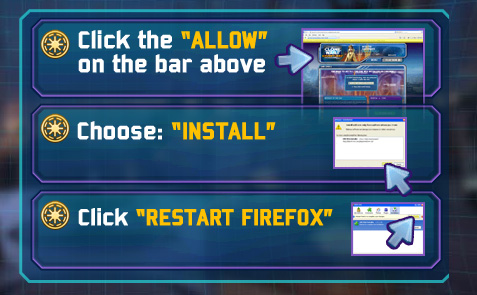
I don’t think there is much to say apart from the fact that to this section, pictured above, there are some  pretty dumb forms leading. And then, with aching fingertips, once you think you can play a game… it asks you to install it and restart the browser? Not to mention double checking that you agreed to T&Cs and asking you to say yes twice! Next time maybe an interactive form that you have to shout at loud enough would tick the box once and for all.

That gives actually one good idea for a live UX experiment: pop in to my place for a tea. Any time you wanna pour more tea to your cup you’d have to go outside(in winted would be even more fun, getting dressed etc.), come back, clean up the cup and then top it up. How does it sound? Like 100k experience? Or like being fucked?

Whatever(catches my eye)

Horishi watanebe

japanese photographer hiroshi watanabe is exhibiting at the ad gallery, switzerland until 17th october 2009. entitled ‘american leitmotiv’, the exhibition will feature Hiroshi Watanabe’s photos handled and developed by his hand which remind us of the authenticity of traditional drawings.

Well there is nothing wrong with his images. But there is everything wrong with the “rationalization”. I was actually reading about W.Benjamin’s aura in Gernot Böhme’s philosophy book on aesthetics of nature (not translated into English, as far as I am aware). He writes about Bejamin’s theory in context of nature which is not that important now, although it is close. Like fake flowers, the above description reveals shallow aspirations. Plastic roses “remind us of the authenticity of” real ones, so why bother? Authenticity is a muddy ground to step on while talking about photography. Pictorialism was one of those fake roses that somehow rubbed shoulders with authenticity. Steichen and Co. created a movement of fake roses lovers, which would try to transgress the borders of mimesis and establish their own visual language. Which Watabene is nicely following. This doesn’t change the fact that “the authenticity of traditional drawings” is a stab in a back, for both Benjamin and Watanabe. If a technique solely would define the piece of art then it would be an easy business. It does certainly have much to do with how you do it but any resemblance to real characters is never intentional.

‘I go to places that captivate and intrigue me. I am interested in what humans do. I seek to capture people, traditions, and locales that first and foremost are of personal interest. I immerse myself with information on the places prior to leaving, but I try to avoid firm, preconceived ideas. I strive for both calculation and discovery in my work, keeping my mind open for surprises. at times, I envision images I’d like to capture, but when I actually look through the viewfinder, my mind goes blank and I photograph whatever catches my eye. photographs I return with are usually different from my original concepts. my photographs reflect both genuine interest in my subject as well as a respect for the element of serendipity, while other times I seek pure beauty.’– hiroshi watanabe

Not much to add. I should pity those artists that piggy-back preconceived ideas saying that they are trying to avoid them and then… they shoot something that even Stieglitz wouldn’t bother, because “ when I actually look through the viewfinder, my mind goes blank and I photograph whatever catches my eye.

But I do not pity them. I envy. Because the beholder(or the ever losing curator) is so naive that doesn’t seem to understand that is being pissed on all over by an artist’s whim.

via